
Mastering Responsive Web Design: Best Practices for Building Mobile-Friendly Websites For Your Business!
These days, Australians practically live on their phones. If your website isn't mobile-friendly, you're waving goodbye to a massive chunk of potential customers online. That's where responsive web design
It's your website's superhero suit – it adapts and flexes to fit any screen size, from a tiny smartphone to a giant desktop monitor. No more pinches, squints, or zooming in and out like you're trying to decipher an ant's shopping list.
But a responsive web design is more than just looking good on mobiles. It should provide a seamless user experience that keeps visitors happy and coming back for more.
Get in and we'll explore the best practices for responsive web design, so your website design can become a digital dream come true.
What's Inside?
- Why Responsive Web Design is Important?
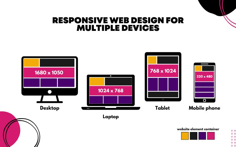
- Responsive Web Design Size Guide and Specifications
- How to Build a Responsive Website - Best Practises
- Let’s Make Responsive Web Design Easy!
Why Responsive Web Design is Important?
Responsive web design matters not only to your business but to your customers. By prioritising it, you also respect their time and make the business process easier for them. As the digital era relies heavily on mobile phones and other devices, there's no other time to get a responsive business website than now!
And here are some stats to convince you to make this game-changing business move!
- 68% of mobile users will engage more with a mobile-responsive website.
- Mobile-responsive eCommerce websites can attract purchases from 67% of online shoppers.
- 85% of social media users access these platforms through mobile.
- Mobile-friendly websites convert 40% better than non-optimised sites.
- 78% of searches done on mobile led to offline purchases for local businesses.
Imagine visiting your favourite website on your desktop and then switching to your phone. What if everything looked the same, with no confusing adjustments needed? That's the magic of responsive web design. It ensures that your website layout looks and feels consistent across all devices—whether you're on a desktop, laptop, tablet, or mobile phone. The buttons, layout, content, and menu stay familiar and intuitive no matter what device you’re using. This consistency gives your visitors a seamless experience, letting them navigate your site comfortably and effortlessly, without any need for adjustments.
That’s the power of a responsive website design.
Responsive Web Design Size Guide and Specifications
How to Build a Responsive Website - Best Practices
Let's dive straight into the best practices and tips on building a responsive web design so your business gets a competitive edge!
Increased Website Speed
It all starts with making your website lightning-fast. A few milliseconds of delay spells the difference between a customer staying or leaving your website. You don't want them to choose the latter, so make sure your site is quick and responsive to keep visitors engaged and happy.
An impressive website speed does more for your business than you know, and here are some awesome benefits you can reap:
Enhanced User Experience
Fast loading times keep users engaged and happy. A slow website leads to frustration and bounces. This is particularly detrimental to mobile data plans where waiting eats into precious data allowance.
Improved Mobile Usability
Mobile users often have slower and less stable internet connections compared to desktops. A fast-loading responsive website ensures a smooth experience even on these connections.
SEO Boost
Search engines like Google prioritise fast-loading websites. A speedy website is more likely to rank higher in search results, leading to increased organic traffic.
Image Compression
Your website images can potentially slow down the site’s loading speed without your knowledge, especially if it's not optimised. As such, optimising images for mobile is the first huge step to take.
There are several ways to compress images for responsive web design, each with its own advantages.
Lossless Compression
This technique reduces file size without sacrificing image quality. It's great for text-based images or logos where maintaining sharp details is crucial.
Lossy Compression
Meanwhile, this method reduces file size more aggressively, but there might be a slight decrease in image quality. However, for photos on your website, the human eye often won't notice the difference, especially when compressed strategically. Tools like Adobe Photoshop and various online services offer lossy compression options.
Resizing Images
Delivering images sized specifically for the device they'll be displayed on can significantly reduce file size. For instance, a large banner image on a desktop need not be the same size on a mobile screen.
Next-Gen Image Formats
Image formats like WebP offer superior compression compared to traditional JPEGs while maintaining good quality. However, browser support for WebP is not universal yet, so it's wise to offer both WebP and JPEG versions as options.
Creating Responsive Web Design Layouts
Think of a responsive layout as your website’s skeleton. It defines how the various elements – text, images, buttons, etc. – are arranged and sized.
In a responsive web design, this layout isn't fixed. It adapts and adjusts based on the device's screen size.
A well-crafted responsive layout offers several advantages for your responsive web design, like an improved user experience, reduced website maintenance, and improved search engine rankings.
Here's how responsive layouts can be employed for a responsive web design:
Flexible Grid Systems
Responsive layouts often utilise flexible grid systems that hold your website's content. They can be set up with columns that shrink or expand depending on the screen size.
Media Queries
These tiny code instructions tell your website's layout how to behave at different screen sizes. For instance, a media query might instruct a two-column layout on the desktop to switch to a single-column layout on mobile devices.
Fluid Units
Instead of using fixed pixel values for sizing elements, responsive layouts use fluid units like percentages or viewport units (vw and vh). These units are relative to the screen size, ensuring elements resize proportionally across devices.
Optimising Button Sizes, Placements
Your call-to-action (CTA) buttons are crucial to website conversion, so making it mobile-responsive matters.
Resizing these buttons for mobile use helps improve your responsive web design in many ways, like having clickable buttons for mobile devices, and improved conversions.
Change up your buttons for strategic and responsive web design with these steps:
Finding The Fold Area
The ‘fold’ refers to the area visible on a screen without scrolling. While important for desktops, mobile users scroll readily. Place key CTAs throughout your content, not just above the fold.
Thumb Zone Targeting
Heatmaps show users tend to interact most with areas reachable by their thumbs while holding the phone. Prioritise button placement in these zones for easy access.
Maintaining Visual Hierarchy
Larger, bolder buttons should denote primary actions, while secondary actions can be smaller and less prominent. This hierarchy helps users quickly identify the most important actions.
Simplified and Clean Website Design
The responsiveness of your website also relies on its design. If it's messy and cluttered, conversions will not come in bunches. So the solution? Simplifying and decluttering it!
Ensure a clean and outstanding website design with these tips:
Prioritising Content
Focus on the most important information and functionalities. Anything that doesn't directly serve your user's needs can be trimmed.
Using White Space
White space isn't just a space. Think of it as giving your content some breathing room. When there's ample white space around text, images, and buttons, everything becomes easier to read and navigate.
Clean and Clear Navigation
Ensure your navigation menu is simple, intuitive, and easy to use, especially on touchscreens. Consider using hamburger menus or mega menus that adapt to different screen sizes.
One Focus Per Page
Avoid cluttering a single page with too much information. Focus on a clear call to action (CTA) or message per page to keep users engaged.
Let’s Make Responsive Web Design Easy!
Building a responsive website can seem daunting, but we're here to offer you a helping hand! We at Elephant in the Boardroom know web design and development, and we transform your website into a responsive champion.
We'll handle all the technical wizardry, so you can focus on what you do best – running your awesome Aussie business.
Ready to take your website from clunky to captivating? Contact Elephant in the Boardroom today for a free consultation!


